
A polymorphic component is a popular React pattern. Even if you’ve never heard of it, you most likely encountered it in code. In a nutshell, the pattern lets you specify which HTML tag to use for rendering your component using as prop.
The flexibility of the polymorphic component also makes it easy to misuse, and that’s where TypeScript can help us. Let’s see how we can use TypeScript and generics to write strongly typed polymorphic components.
Overview of polymorphic components
First, let’s see how you would use polymorphic components. Say you have a Button component that you want to render as an HTML link. If Button is a polymorphic component, you can write it like this:
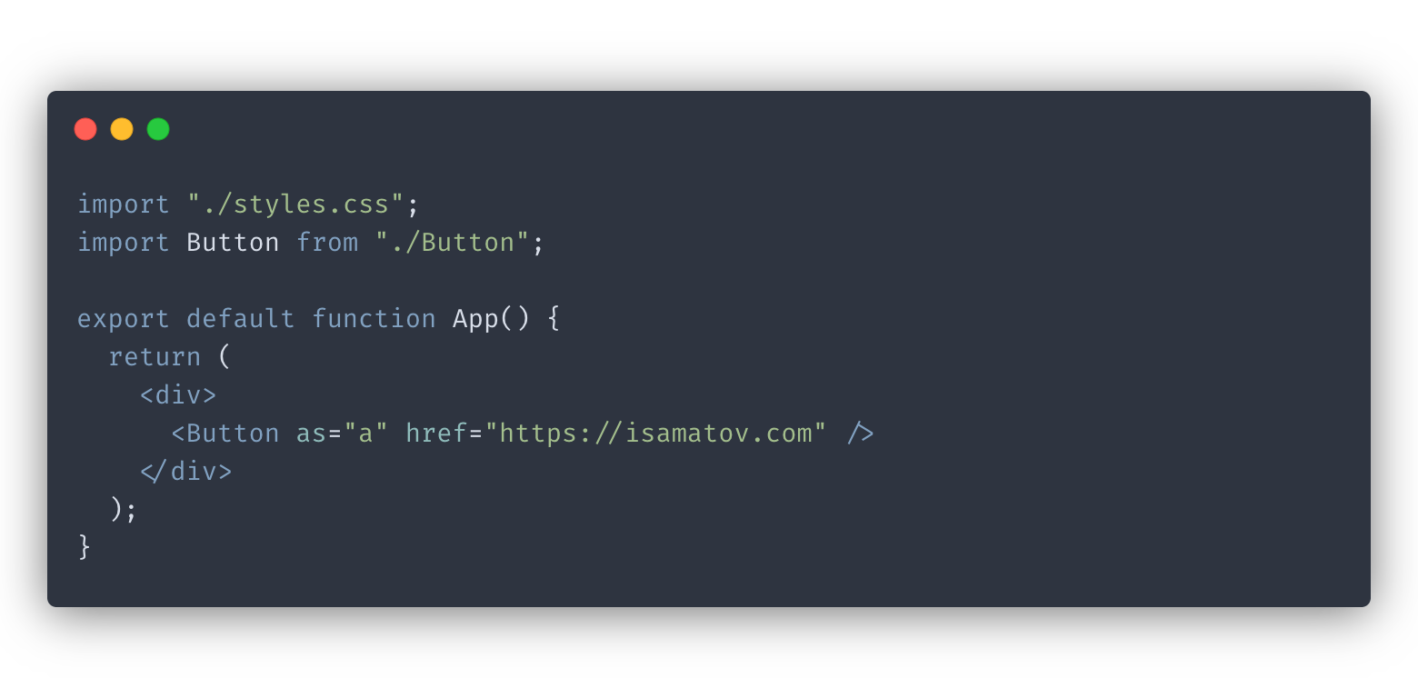
Our button will render as a tag and accept the same props a tag accepts, like href.
Simple implementation
Now let’s get to the implementation. Without type checking, the pattern is rudimentary to implement:
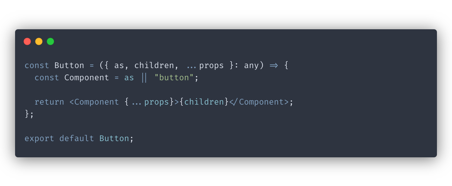
In our example above, we avoid any type checking by setting the component props type to any.
Here is the line that makes our pattern work:
const Component = as || "button";
We render our component using the value of the as prop or use the button tag as a fallback. And that’s all we need to make this implementation work.
The problem with this approach is that there is no mechanism to prevent the client from passing incorrect props:

We specified the href property, which belongs to the a tag, without setting our as prop. Ideally, TypeScript would catch this bug immediately, and we would see an error.
Type checking with TypeScript
Our next step is to tighten up the prop type checking for our component.
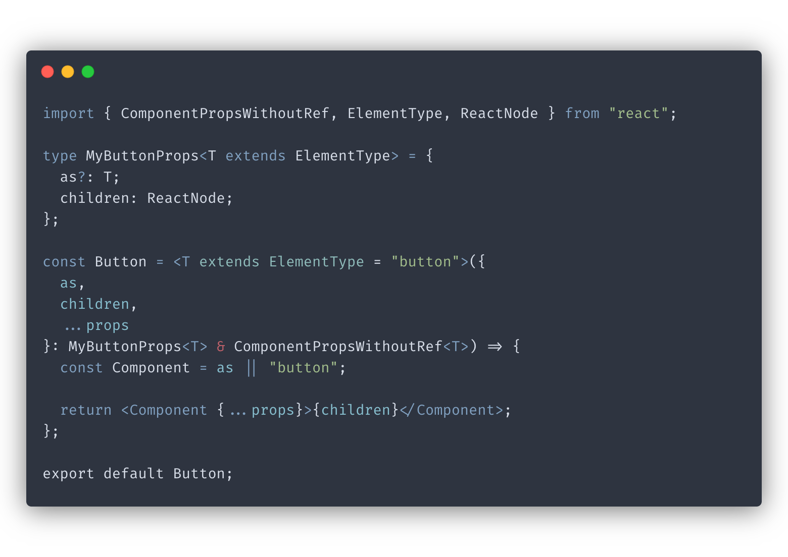
The code above introduces generics. We made our component generic on the following line:
const Button = <T extends ElementType = "button">
ElementType
is a utility type from React. We set our generic parameter T to ElementType to ensure our button only accepts HTML tags and other React component types.
We pass T to the MyButtonProps type that stores the props we define manually. Within MyButtonProps, we set the type of the as prop to T, which glues it all together.
The final type of the Button props is MyButtonProps<T> & ComponentPropsWithoutRef<T>. This type is a combination of the props we specified manually and
ComponentPropsWithoutRef
. ComponentPropsWithoutRef is a type from React library that contains a basic set of props for React components.
At this point, our Button component can dynamically calculate the props it accepts based on the value of as. If we try our client example earlier, we will see an error like we should:
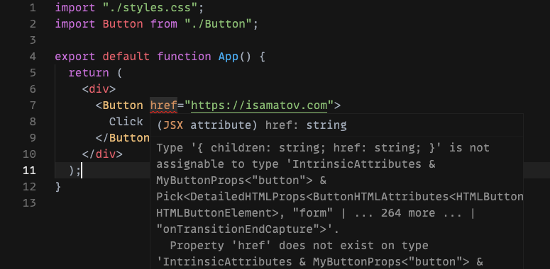
The error message is convoluted, but the important part is: Property 'href' does not exist on type 'IntrinsicAttributes & MyButtonProps<"button">.
Our Button component no longer accepts the href property because it doesn’t render itself as a link. If we add as="a", the error goes away.
Our component looks good, but there’s one more thing to tweak. We want to make sure there are no name collisions between the props we specify manually and the props provided by ComponentPropsWithoutRef. Having name collisions can cause confusing TypeScript warnings.
Fixing the error is simple: all we need to do is adjust the final type of the component’s props to use Omit :
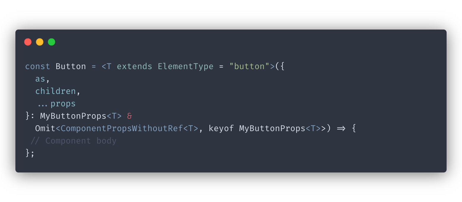
Omit is a TypeScript utility that constructs a new type by excluding any prop keys in MyButtonProps from ComponentPropsWithoutRef. Using Omit, we made sure to avoid name collision conflicts between the two types. Check out my post to learn more about
TypeScript utility types useful in React
.
Now our Button component is ready!
Conclusion
In this post, we learned to write strongly typed polymorphic components using TypeScript and generics.
Using this approach and using TypeScript with React, in general, is definitely more work upfront. But it’s all worth it in the end because we improve our development experience by providing additional guarantees in our code.
If you’d like to get more web development, React and TypeScript tips consider
following me on Twitter,
where I share things as I learn them.
Happy coding!