Recently I needed to build a robust, fully-responsive grid that supports dragging for the project I’m working on - YourTrail . After quite a bit of research, I picked React-Grid-Layout for various reasons.
This post is a deep dive into the library with a step-by-step tutorial on setting up a responsive grid.

Why use React-Grid-Layout
React-Grid-Layout is a powerful React library that allows you to create grids with absolute control over the layout. You can customize everything from the column and row widths, to how cells are positioned within the grid.
With that said, Reac-Grid-Layout is not the only option out there. You can use other grid libraries, like gridstack or gridster . So let’s cover why React-Grid-Layout might be a better option for your project.
Written specifically for React. React-Grid-Layout is a library written specifically for React that provides a familiar component-based API. It also doesn’t require any additional dependencies, like jQuery.
Supports responsive UI and breakpoints. React-Grid-Layout makes it easy to add support for mobile. You can specify different breakpoints and configure how your grid behaves at each one. This makes it easy to create layouts that look good on all devices.
TypeScript support. React-Grid-Layout provides TypeScript support with DefinitelyTyped , which helps write more robust code.
Setting up the basic dashboard
Now let’s get started with the tutorial. We’ll use styled-components to style our grid, but the styling will be minimal.
First, install the package:
npm install react-grid-layout
Then import the GridLayout component:
import GridLayout from "react-grid-layout";
The component accepts any DOM node as children, so we don’t need to use any specific grid item components. Here’s the overview of the props this grid needs to work:
layout- an array of objects that specify the location of items on the grid. This prop will dictate how the items on your grid are positioned.cols- the number of columns the grid will havewidth- the width of the grid in pixels. We’ll hardcode this value for now, but in the next section, we’ll take a look at the responsive solution.rowHeight- the height of each row. This number must be static for the grid to function correctly. However, you can still have variable-height items by specifying the different number of rows each item takes.
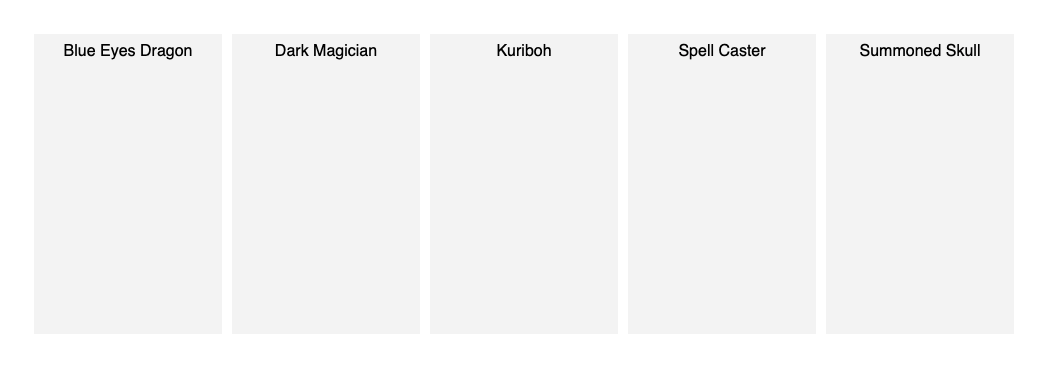
Let’s set up a basic grid with some dummy data and see what we have:
|
|
Our grid has five columns and a rowHeight value of 300 pixels. Notice the format of the items in the layout: each item has a unique id i, width, height, and x and y position.
GridLayout matches items with their layout information using the key property. So make sure the key matches i of the corresponding layout item.
Here’s what the initial grid would look like:
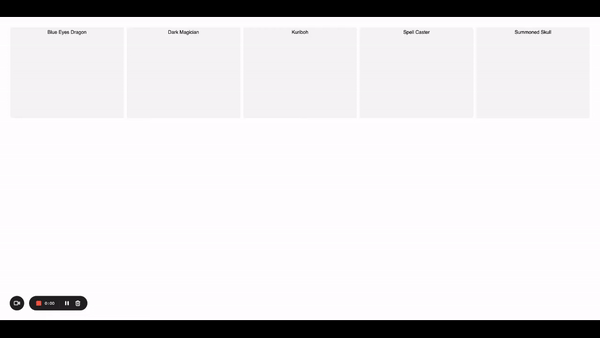
Dragging
Luckily, dragging comes out of the box in react-grid-layout and is turned on by default. In order to disable it, you need to set the draggable={false} for both GridLayout and its children items.
Another thing that comes by default is compacting a messy layout. It helps when you have items stacked upon each other in an unorganized way. The compacting is triggered when the layout changes due to adding/removing grid items or resizing the browser window.
You can configure the compacting logic using the compactType prop. The possible values are horizontal | vertical. It’s set to vertical by default.
Here’s what compacting looks like in action:

Notice how the item on the second row shifts to the top as soon as we moved the item that was before it.
Making it responsive
Now that we have our basic grid working, it’s time to add responsiveness to make it reduce or increase the number of columns based on the width of the screen. For that to happen, we need to listen to changes in screen size and provide a different layout object based on the current width of the screen. Luckily, React-Grid-Layout provides a solution for this - the WidthProvider
HOC
.
Here’s how to use it:
|
|
We created a ResponsiveGridLayout grid by wrapping the Responsive grid component with the WidthProvider HOC.
The difference between the Responsive component and GridLayout we used earlier is that the Responsive layout uses breakpoints and multiple different layout objects to configure the grid based on the screen width.
WidthProvider automatically listens to the screen width changes and notifies Responsive when it needs to adjust the layout.
Now let’s use our ResponsiveGridLayout to setup our responsive grid with breakpoints:
|
|
We added a new prop called breakPoints that defines our custom breakpoints. Note that these breakpoints are for the width of the grid component, not the whole screen.
cols prop provides the number of columns each breakpoint needs to have. Our maximum is five columns, and the minimum is one. This ensures that our grid looks good on tablets and mobile devices.
Instead of using the layout prop, we’re using layouts to provide a separate layout for each breakpoint. Also, notice how we’ve only specified the layout for the lg breakpoint. You don’t have to provide layouts for all breakpoints, just lg. If you omit the other ones, react-grid-layout will calculate them based on the compacting rules.
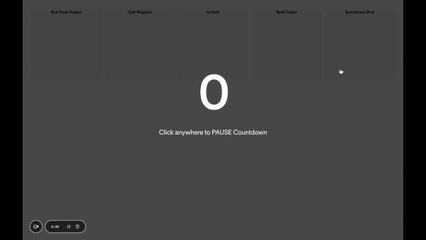
Here’s what our new responsive grid looks like when you resize it:
Persisting data
So far, so good. We have a responsive grid that we can drag and resize. But what if we want to save the layout so that when the user comes back, the items are in the same position?
This is where data persistence comes into play. Where exactly you keep the data depends on your application requirements. But generally speaking, we want to save the layout object for later use. In this tutorial, we’ll save our layout in local storage.
With react-grid-layout persisting data is as easy as adding the onLayoutChange listener:
|
|
Our handleLayoutChange handler is triggered each time the layout of the grid changes. The handler calls localStorage.setItem to store the new layouts object.
The next time we render our grid, we can use this data to populate the initial state of our grid items. And that’s precisely what getLayouts does. It returns the saved layouts object used to populate our grid with the correct data.
Now, if you reload the page and resize the browser window, you’ll see that the items in the grid stay in their respective positions:
Conclusion
In this post, we’ve seen how easy it is to use react-grid-layout to create a responsive grid. We’ve also learned how to persist the layout so that the grid items stay in their respective positions when the user reloads the page.
If you’d like to get more web development, React and TypeScript tips consider
following me on Twitter
where I share things as I learn them.
Happy coding!