This page looks best with JavaScript enabled

Compound Component – advanced React pattern UI libraries love

 ·  ☕ 10 min read  ·  ✍️ Iskander Samatov

compound component


In this post, let’s take a look at a popular React pattern – Compound Component. This pattern allows writing complex components in a clean and declarative way. It proved to be so useful that almost all of the popular React UI libraries, such as Material UISemantic UIChakra UI, and many others, ended up adopting it.

This post will include the older way of building compound components and the newer version that uses hooks and Context API.

I’ll be writing components using the Emotion styling library and TypeScript.

What is the Compound Component pattern?

As mentioned before, the Compound components pattern allows writing a declarative and flexible API for complex components. You build the component using multiple loosely coupled child components. Each of them performs a different task, yet they all share the same implicit state. When put together, these child components make up our compound component.

You have, no doubt, encountered compound components before when working with a UI library. Take a look at this snippet:

 1
 2
 3
 4
 5
 6
 7
 8
 9
10
11
12
13
14
15
16
17
18
19
20
21
22
23
24
25
26
27
28
29
30
31
export default function App() {
  return (
    <div className="App">
      <Accordion>
        <AccordionItem id="1">
          <AccordionHeader>Header 1</AccordionHeader>
          <AccordionPanel>
            Lorem ipsum dolor sit amet, consectetur adipiscing elit, sed do
            eiusmod tempor incididunt ut labore et dolore magna aliqua.
          </AccordionPanel>
        </AccordionItem>
        <AccordionItem id="2">
          <AccordionHeader>Header 2</AccordionHeader>
          <AccordionPanel>
            Ut enim ad minim veniam, quis nostrud exercitation ullamco laboris
            nisi ut aliquip ex ea commodo consequat. Duis aute irure dolor in
            reprehenderit in voluptate velit esse cillum dolore eu fugiat nulla
            pariatur.
          </AccordionPanel>
        </AccordionItem>
        <AccordionItem id="3">
          <AccordionHeader>Header 3</AccordionHeader>
          <AccordionPanel>
            Excepteur sint occaecat cupidatat non proident, sunt in culpa qui
            officia deserunt mollit anim id est laborum.
          </AccordionPanel>
        </AccordionItem>
      </Accordion>
    </div>
  );
}

Does the structure look familiar? That’s what the API typically looks like for compound components.

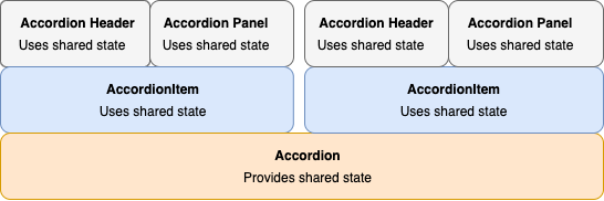
Here’s the structure of the Accordion component at a high level:

compound components


As a side note, a lot of UI libraries use . for their compound component API like so:

1
2
3
4
5
6
7
<Dropdown text="File">
    <Dropdown.Menu>
      <Dropdown.Item text="New" />
      <Dropdown.Item text="Open..."  />
      <Dropdown.Item text="Save as..."  />
    </Dropdown.Menu>
</Dropdown>

This approach is strictly optional and you can write your component however you prefer. It doesn’t affect the end result in any significant way.

Why use the Compound Component pattern?

To reiterate, the main advantage of building complex components this way is how easy it is to use them. Thanks to the implicit state, the inner workings of the compound component are hidden from the clients. At the same time, the clients get the flexibility to rearrange and customize the child components in any way they please.

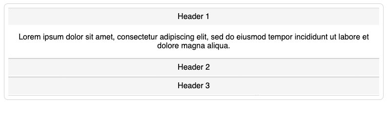
Notice how we declaratively listed the content of the Accordion yet didn’t have to meddle with its inner state.

Accordion will handle all of the inner state logic, including shrinking and expanding items on click. All we had to do is list the items in the order we want.

So let’s go over the advantages of using the Compound Component pattern one last time:

  1. The API for your component is declarative.
  2. Your child components are loosely coupled. That makes it easy to reorder, add and remove the child component without affecting its siblings.
  3. Much easier to style and change the design of the component.

Now that you’re hopefully convinced to give this thing a shot, let’s start with the tutorial. We will build the Accordion we’ve been talking about this whole time.

accordion compound components

As promised, we’ll go over both the older and the newer approaches.

Older approach

Helper Methods

The old way of sharing state between the children involved using two React methods: React.Children.map and cloneElement. Let’s cover them briefly.

React.Children.map lets you iterate over the children property of your component the same way you would iterate over an array. According to the official docs: “Invokes a function on every immediate child contained within children with this set to thisArg. If children is an array it will be traversed and the function will be called for each child in the array.”

cloneElement lets you create a copy of any React element and pass any additional props you like. According to the docs: “Clone and return a new React element using the element as the starting point.”

Accordion

Accordion is the parent component that shares the state with all of its children.

 1
 2
 3
 4
 5
 6
 7
 8
 9
10
11
12
13
14
15
16
17
18
19
20
21
import styled from "@emotion/styled";
import { Children, cloneElement, ReactNode, useState } from "react";
 
const AccordionContainer = styled.div`
  border: 1px solid #d3d3d3;
  border-radius: 8px;
  padding: 8px;
`;

 
function Accordion({ children }: { children: ReactNode }) {
  const [openItem, setOpenItem] = useState(null);

  return (
    <AccordionContainer>
      {Children.map(children, (child: any) =>
        cloneElement(child, { openItem, setOpenItem })
      )}
    </AccordionContainer>
  );
}

We use React.Children.map and cloneElement together to iterate over the children property. For each child, we clone the element and pass additional properties openItem and setOpenItem that we will use to set the currently active item.

AccordionItem

AccordionItem is interesting in that it’s both a parent and a child. It’s a child of the Accordion component, but it’s also a parent to the AccordionHeader and AccordionPanel components. It also uses cloneElement to pass on the props it received from Accordion to its children.

Here’s the code:

 1
 2
 3
 4
 5
 6
 7
 8
 9
10
11
12
13
14
15
16
17
18
19
export const AccordionItem = ({
  children,
  openItem,
  setOpenItem,
  id
}: {
  children: ReactNode;
  openItem?: string;
  setOpenItem?: any;
  id: string;
}) => {
  return (
    <div>
      {Children.map(children, (child: any) =>
        cloneElement(child, { openItem, setOpenItem, id })
      )}
    </div>
  );
};

AccordionHeader

This component will register the onClick event that will allow us to shrink/expand each item. For that, we use the setOpenItem method received from AccordionItem.

 1
 2
 3
 4
 5
 6
 7
 8
 9
10
11
12
13
14
15
16
17
18
19
20
21
22
23
24
import styled from "@emotion/styled";

const AccordionHeaderContainer = styled.div`
  padding: 8px 16px;
  background: #f5f5f5;
  border-top: 1px solid #d3d3d3;
  cursor: pointer;
`;

export const AccordionHeader = ({
  setOpenItem,
  id,
  children
}: {
  setOpenItem?: any;
  id?: string;
  children: ReactNode;
}) => {
  return (
    <AccordionHeaderContainer onClick={() => setOpenItem(id)}>
      {children}
    </AccordionHeaderContainer>
  );
};

AccordionPanel

This component is responsible for displaying the content of the AccordionItem. It shrinks or expands based on the value of the openItem property.

 1
 2
 3
 4
 5
 6
 7
 8
 9
10
11
12
13
14
15
16
17
18
19
20
21
22
23
24
25
26
27
import styled from "@emotion/styled";

const AccordionPanelContainer = styled.div<{ height: string; padding: string }>`
  padding: ${({ padding }: { padding: string }) => padding};
  height: ${({ height }: { height: string }) => height};
  overflow: hidden;
  border-bottom: 1px solid #d3d3d3;
`;

export const AccordionPanel = ({
  children,
  openItem,
  id
}: {
  children: ReactNode;
  openItem?: string;
  id?: string;
}) => {
  return (
    <AccordionPanelContainer
      padding={openItem === id ? "16px" : "0px"}
      height={openItem === id ? "fit-content" : "0px"}
    >
      {children}
    </AccordionPanelContainer>
  );
};

And that’s all there’s it to it! This implementation works, but it limits us on how we can structure the children. For example, our API will break if you try using some other elements as children of Accordion like so:

 1
 2
 3
 4
 5
 6
 7
 8
 9
10
11
12
13
14
15
16
17
18
19
20
21
22
23
24
25
26
27
28
29
30
31
32
33
export default function App() {
  return (
    <div className="App">
      <Accordion>
        <div>
          <AccordionItem id="1">
            <AccordionHeader>Header 1</AccordionHeader>
            <AccordionPanel>
              Lorem ipsum dolor sit amet, consectetur adipiscing elit, sed do
              eiusmod tempor incididunt ut labore et dolore magna aliqua.
            </AccordionPanel>
          </AccordionItem>
        </div>
        <AccordionItem id="2">
          <AccordionHeader>Header 2</AccordionHeader>
          <AccordionPanel>
            Ut enim ad minim veniam, quis nostrud exercitation ullamco laboris
            nisi ut aliquip ex ea commodo consequat. Duis aute irure dolor in
            reprehenderit in voluptate velit esse cillum dolore eu fugiat nulla
            pariatur.
          </AccordionPanel>
        </AccordionItem>
        <AccordionItem id="3">
          <AccordionHeader>Header 3</AccordionHeader>
          <AccordionPanel>
            Excepteur sint occaecat cupidatat non proident, sunt in culpa qui
            officia deserunt mollit anim id est laborum.
          </AccordionPanel>
        </AccordionItem>
      </Accordion>
    </div>
  );
}

Here’s the error:

accordion error


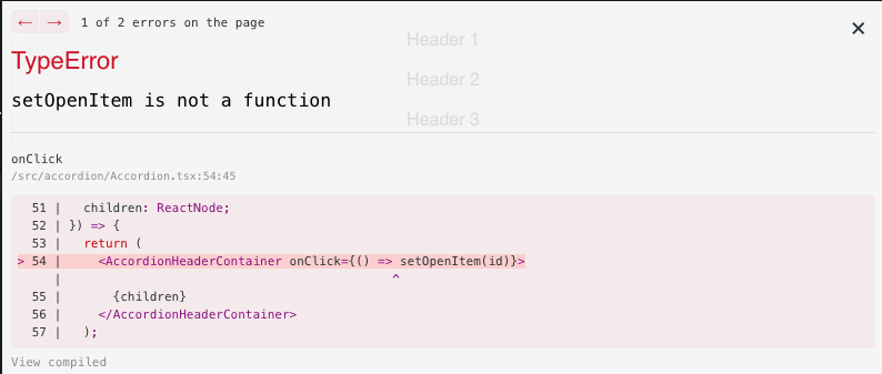
The reason for it is that React.Children.map can only iterate on the direct children of the Accordion, so nesting children in a div won’t work.

We can do better. Let’s look at the newer implementation that uses the Context API instead.

Newer approach

First of all, a lot of the code will be similar. The main difference is that rather than using React.Children.Map and cloneElement to share props, we use the Context API and create a provider.

Accordion

Here’s our new implementation of Accordion:

 1
 2
 3
 4
 5
 6
 7
 8
 9
10
11
12
13
14
15
16
17
18
19
20
21
22
23
24
25
26
27
28
29
30
31
32
33
34
35
36
37
38
import styled from "@emotion/styled";
import {
  Children,
  cloneElement,
  Context,
  createContext,
  ReactNode,
  useContext,
  useMemo,
  useState
} from "react";

const AccordionContext: Context<{
  openItem: string;
  setOpenItem: any;
}> = createContext({
  openItem: "",
  setOpenItem: null
});
const AccordionContainer = styled.div`
  border: 1px solid #d3d3d3;
  border-radius: 8px;
  padding: 8px;
`;

function Accordion({ children }: { children: ReactNode }) {
  const [openItem, setOpenItem] = useState("");

  const value = useMemo(() => ({ openItem, setOpenItem }), [openItem]);

  return (
    <AccordionContainer>
      <AccordionContext.Provider value={value}>
        {children}
      </AccordionContext.Provider>
    </AccordionContainer>
  );
}

We create AccordionContext and use AccordionContext.Provider to pass openItem and setOpenItem props. Also note how we wrapped value with useMemo to prevent redundant re-renders.

AccordionItem

Here’s the code for AccordionItem:

 1
 2
 3
 4
 5
 6
 7
 8
 9
10
11
12
13
export const AccordionItem = ({
  children,
  id
}: {
  children: ReactNode;
  id: string;
}) => {
  return (
    <div>
      {Children.map(children, (child: any) => cloneElement(child, { id }))}
    </div>
  );
};

Notice how we no longer need to pass the props received from the Accordion. But we’re still using cloneElement here to pass the id prop.

AccordionPanel & AccordionHeader

These child elements now pull the shared state directly from the context using the useContext hook. Here’s the implementation of both of them:

 1
 2
 3
 4
 5
 6
 7
 8
 9
10
11
12
13
14
15
16
17
18
19
20
21
22
23
24
25
26
27
28
29
30
31
32
33
34
35
36
37
38
39
40
41
42
43
44
45
46
47
48
const useAccordionContext = () => useContext(AccordionContext);

const AccordionHeaderContainer = styled.div`
  padding: 8px 16px;
  background: #f5f5f5;
  border-top: 1px solid #d3d3d3;
  cursor: pointer;
`;

const AccordionPanelContainer = styled.div<{ height: string; padding: string }>`
  padding: ${({ padding }: { padding: string }) => padding};
  height: ${({ height }: { height: string }) => height};
  overflow: hidden;
  border-bottom: 1px solid #d3d3d3;
`;

export const AccordionHeader = ({
  id,
  children
}: {
  id?: string;
  children: ReactNode;
}) => {
  const { setOpenItem } = useAccordionContext();
  return (
    <AccordionHeaderContainer onClick={() => setOpenItem(id)}>
      {children}
    </AccordionHeaderContainer>
  );
};

export const AccordionPanel = ({
  children,
  id
}: {
  children: ReactNode;
  id?: string;
}) => {
  const { openItem } = useAccordionContext();
  return (
    <AccordionPanelContainer
      padding={openItem === id ? "16px" : "0px"}
      height={openItem === id ? "fit-content" : "2px"}
    >
      {children}
    </AccordionPanelContainer>
  );
};

Overall, this implementation has less code and better performance. That’s because cloneElement causes a slight performance penalty.

However, the main advantage is that we have a much more flexible API for our Accordion, and the example code that broke earlier now works just fine.

Conclusion

Components build with the Compound Component patterns are a joy to use. Using this pattern, you’re better equipped for constant changes in design and functional requirements. Something that happens a lot when building software. I hope you found this post useful!

Thanks to Ken C. Todds for this great article that explains the concept.

Here’s the link to the CodeSandbox with the full code of this tutorial.

If you’d like to get more web development, React and TypeScript tips consider following me on Twitter, where I share things as I learn them.
Happy coding!

Share on

Software Development Tutorials
WRITTEN BY
Iskander Samatov
The best up-to-date tutorials on React, JavaScript and web development.